728x90
300x250
SMALL
부트스트랩 cdn 셋팅이 끝났다면
https://moo-you.tistory.com/663
[부트스트랩] 시작하기
1. bootstrap 사이트 접속 https://getbootstrap.com/ Bootstrap The most popular HTML, CSS, and JS library in the world. getbootstrap.com 2. 메인에서 Read the docs 클릭 3. Quick start를 보면 index.htm..
moo-you.tistory.com
components 메뉴에서 원하는 컴포넌트를 사용할 수 있다.
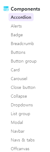
수많은 컴포넌트 중에서 먼저 제일 위에 Accordion을 사용해 보자
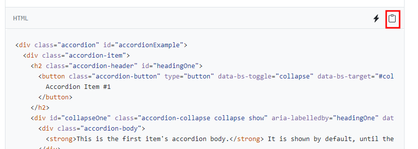
메뉴를 클릭하면 다양한 종류의 아코디언이 나오고 그 중 하나의 html 코드를 복사해와서 작업하는 파일에 body 안 원하는 위치에 붙여 넣기를 한다.
<!doctype html>
<html lang="en">
  <head>
    <meta charset="utf-8">
    <meta name="viewport" content="width=device-width, initial-scale=1">
    <title>Bootstrap demo</title>
    <link href="https://cdn.jsdelivr.net/npm/bootstrap@5.2.0/dist/css/bootstrap.min.css" rel="stylesheet" integrity="sha384-gH2yIJqKdNHPEq0n4Mqa/HGKIhSkIHeL5AyhkYV8i59U5AR6csBvApHHNl/vI1Bx" crossorigin="anonymous">
  </head>
  <body>
    <h1>Hello, world!</h1>

    <div class="accordion" id="accordionExample">
        <div class="accordion-item">
          <h2 class="accordion-header" id="headingOne">
            <button class="accordion-button" type="button" data-bs-toggle="collapse" data-bs-target="#collapseOne" aria-expanded="true" aria-controls="collapseOne">
              Accordion Item #1
            </button>
          </h2>
          <div id="collapseOne" class="accordion-collapse collapse show" aria-labelledby="headingOne" data-bs-parent="#accordionExample">
            <div class="accordion-body">
              <strong>This is the first item's accordion body.</strong> It is shown by default, until the collapse plugin adds the appropriate classes that we use to style each element. These classes control the overall appearance, as well as the showing and hiding via CSS transitions. You can modify any of this with custom CSS or overriding our default variables. It's also worth noting that just about any HTML can go within the <code>.accordion-body</code>, though the transition does limit overflow.
            </div>
          </div>
        </div>
        <div class="accordion-item">
          <h2 class="accordion-header" id="headingTwo">
            <button class="accordion-button collapsed" type="button" data-bs-toggle="collapse" data-bs-target="#collapseTwo" aria-expanded="false" aria-controls="collapseTwo">
              Accordion Item #2
            </button>
          </h2>
          <div id="collapseTwo" class="accordion-collapse collapse" aria-labelledby="headingTwo" data-bs-parent="#accordionExample">
            <div class="accordion-body">
              <strong>This is the second item's accordion body.</strong> It is hidden by default, until the collapse plugin adds the appropriate classes that we use to style each element. These classes control the overall appearance, as well as the showing and hiding via CSS transitions. You can modify any of this with custom CSS or overriding our default variables. It's also worth noting that just about any HTML can go within the <code>.accordion-body</code>, though the transition does limit overflow.
            </div>
          </div>
        </div>
        <div class="accordion-item">
          <h2 class="accordion-header" id="headingThree">
            <button class="accordion-button collapsed" type="button" data-bs-toggle="collapse" data-bs-target="#collapseThree" aria-expanded="false" aria-controls="collapseThree">
              Accordion Item #3
            </button>
          </h2>
          <div id="collapseThree" class="accordion-collapse collapse" aria-labelledby="headingThree" data-bs-parent="#accordionExample">
            <div class="accordion-body">
              <strong>This is the third item's accordion body.</strong> It is hidden by default, until the collapse plugin adds the appropriate classes that we use to style each element. These classes control the overall appearance, as well as the showing and hiding via CSS transitions. You can modify any of this with custom CSS or overriding our default variables. It's also worth noting that just about any HTML can go within the <code>.accordion-body</code>, though the transition does limit overflow.
            </div>
          </div>
        </div>
      </div>

    <script src="https://cdn.jsdelivr.net/npm/bootstrap@5.2.0/dist/js/bootstrap.bundle.min.js" integrity="sha384-A3rJD856KowSb7dwlZdYEkO39Gagi7vIsF0jrRAoQmDKKtQBHUuLZ9AsSv4jD4Xa" crossorigin="anonymous"></script>
  </body>
</html>
그러면 이렇게 간단하게 아코디언 컴포넌트를 적용 시킬 수 있다.

728x90
반응형
LIST
'Front-end > bootstrap' 카테고리의 다른 글
| [부트스트랩] 그리드 시스템 (0) | 2022.08.20 |
|---|---|
| [부트스트랩] 시작하기 (0) | 2022.08.14 |
댓글